Why Your Healthcare Website Must Be Mobile-Friendly
Imagine searching for a doctor on your smartphone.
You click a website.
It loads slowly.
The text is too small.
The menu is difficult to use.
The appointment button is hard to find.
What would you do?
You might simply go back and choose another result.
That’s why mobile-friendly design is essential.
Patients Search Using Smartphones
A patient may search while:
- Travelling
- At work
- At home
- Looking for directions
- Comparing doctors
Your website should work wherever the search happens.
What Does Mobile-Friendly Mean?
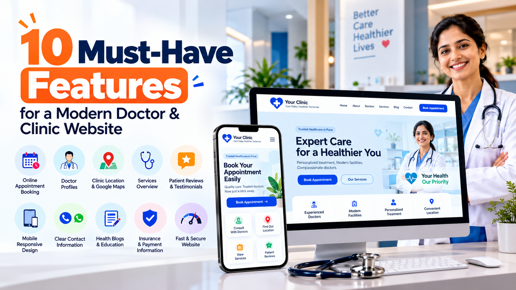
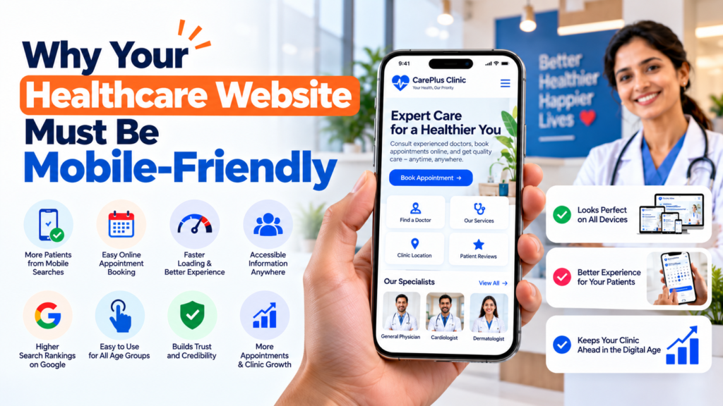
A mobile-friendly healthcare website should have:
- Responsive design
- Readable text
- Easy navigation
- Fast loading
- Touch-friendly buttons
- Click-to-call
- Easy appointment forms
- Location information
Put Important Information First
A mobile visitor shouldn’t have to scroll through several sections to find your phone number.
Important actions should be visible:
Call Clinic
Book Appointment
Get Directions
Speed Matters
Large images, unnecessary animations and poorly optimized scripts can slow down a website.
Devnxt’s existing guide covers image optimization, caching, CDN usage, server response time and other website-speed improvements. Devnxt Technologies
Mobile Design Should Reduce Friction
A patient may only need three answers:
Is this the right doctor?
Where is the clinic?
How do I book?
Your mobile experience should make those answers easy to find.
Test Your Website Like a Patient
Open your website on your phone.
Try to:
- Find the doctor
- Find services
- Find phone number
- Find location
- Request an appointment
If any step is difficult, improve it.
Build a Mobile-Friendly Healthcare Website
Devnxt develops responsive websites designed to work across smartphones, tablets and desktop devices.
👉 Explore Healthcare Website Development in Pune.